

Ready to sell on mobile?
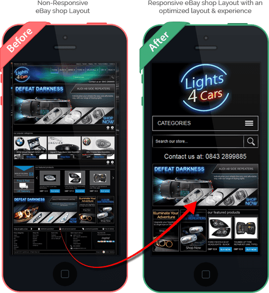
eBay mobile responsive shop and item description layout

Features
 Increased readability
  No need to zoom
  Automatically switches
desktop and mobile
 Category navigation with large
touch-friendly buttons
 eBay mobile app
compatible
 No additional work
required by the seller
 Automatically applied
to existing layout
 Works with all devices
 Mobile devices conquer the world of eBay shopping. Is your business ready to sell on mobile?
Before finding out if your business has what it takes to survive this conquest, you need to know a few simple things about mobile internet usage:
- by the end of 2016 mobile internet usage will match desktop usage;
- more interesting, by the end of 2016 there will be more mobile devices on the planet than people;
- 56% of people are proud owners of a smart phone;
- 50% of the people mentioned above access the Internet mainly from their mobile devices.
And now, if we were to relate mobile usage with online sales, here are the conclusions
- over 20% of Google searches are being performed on a mobile device;
- 72% of tablet owners do their weekly shopping online;
- eBay has over $22 billion of gross merchandise volume from mobile sales alone (this means a 130% growth in buyers using mobile devices to buy from eBay sellers);
- at least 30% of all eBay sales are transacted through mobile devices;
- 61% of people love more brands that offer a great mobile experience.
- loss in business opportunities;
- frustrated customers who will eventually turn into lost customers;
- slow running website that will frustrate your users and eventually turn them into lost customers;
- a Google not so happy with your unresponsive website which leads to SEO errors.
So, mobile devices are the future of online shopping, and your eBay business is still not ready to welcome them as they deserve? Here are your options:
Mobile template – requires a second website or sub-domain destined only for mobile users; it is built for each specific device, not per screen size;
Mobile responsive design – requires only one website that is coded to adapt to all screen sizes.
The winner?!
Mobile Responsive Design, without any doubt!
Here is why:
Users love a website that looks good regardless of the mobile device they use. If they don’t like what they see, they will just take their money and search for a more good-looking website (that’s just life!). If they do love your website’s mobile look, there are 67% more chances for them to buy the product or use the service.
55% of social media consumption happens on a mobile device (which is a lot!). You need social media for the glory of your business, so you need to make sure that your links are mobile friendly or else…conversion rates get low, bounce rates get high and potential customers get headaches and just leave.
It ensures a speedy responsive website because, let’s face it, who wants to spend more than a few seconds for the loading of a website? We just don’t have that much time! A mobile responsive design assures that the entire page of a website within seconds. This is just impossible with a desktop website.
Google loves mobile responsive websites! And we want to make sure that our website or eBay listings are what Google loves!
The future is mobile! A mobile responsive website will be ready to face all new mobile devices and offer user friendly experiences regardless of the fanciness of the customers’ mobile innovations.
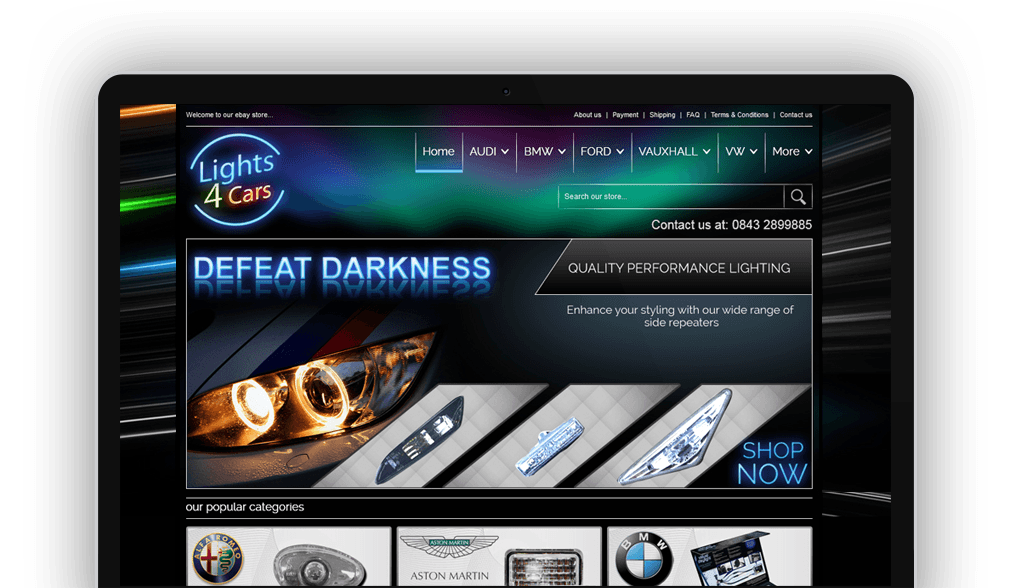
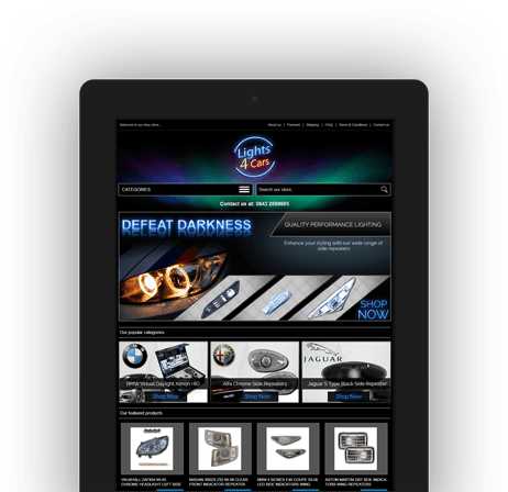
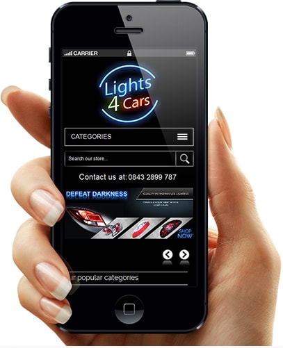
RESPONSIVE EBAY SHOP LAYOUT
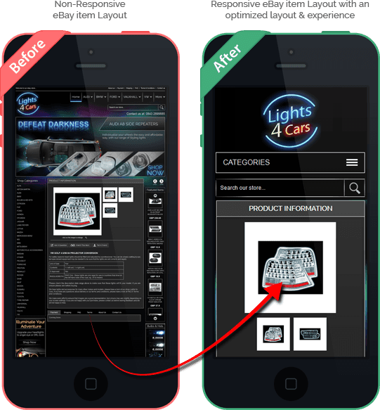
RESPONSIVE EBAY ITEM LAYOUT